Tuesday, February 12, 2013

Valentine Boxes

This year for Valentine's Day, I made my nephews, William and Brady, exploding boxes filled with candy. I'd never made an exploding box before, though I really like the idea. I'm looking forward to doing it again with photographs.

I used the directions at "Suzannes Card Craft's" to help me understand the principles of the exploding box. The measurements, given in centimeters, baffled this Ugly American but I did understand the concept of a Brady Bunch style grid with all squares an equal size. My base/biggest box was made from a square measuring 8.25, the next from one measuring 7.5", and the smallest from one measuring 6.75". The individual squares are 2.75", 2.5", and 2.25", respectively. The contrasting paper was cut using the measurements from the square one level down, if you get my drift. The outer box's contrasting paper squares are 2.5, the middle 2.25, and the smallest I didn't really measure; I just took a small square and hacked it down a bit.

I printed vintage Valentines for the biggest box's inside surprise. For the surprises of the inner boxes, I glued individually wrapped candies. I think the boxes will become pretty much destroyed on the inside when the candies are removed, but I took pictures, so we'll never forget their loveliness.

For the initials on top, I completely stink at drawing my own letters. Instead, I experimented with fonts on the computer, making sure the letters fit into a 2.5 x 2.5 text box. I then printed the initials and used a bone folder to trace the letters on the back of the contrasting paper. I finished the letters using glitter.

It was a little tough to squeeze the box back together with the candy glued inside... I'm not really good at predicting volume, either. But I am pretty good at making exploding boxes! Hope the boys like them.


Sunday, October 14, 2012

Password organizer


A few days ago I received an email from Google warning me that someone in Mexico attempted to access my account. Was this me?

Ummmm, no.

And, yes, it was a good catalyst to do what I know I should be doing, and have planned to do-- use weirder passwords and change them more often.

Of course, in doing that, I'd have a more difficult time remembering them. So, I decided to create a password organizer. I guess if someone goes to all the trouble to break into my house and take it along with all the electronics, I'll be out of luck. But they'll have a pretty little password organizer!

First, I Googled terms like "password organizer template" and looked at what information these various examples used. I used Caslon Antique Italic font and arranged my information, knowing that I also wanted to incorporate graphics from The Graphics Fairy. I chose to use a Remington typewriter, Engineer's compass, hand holding a card, and men in ties above a sign. I created two to a page in landscape and cut in half. The left side I left straight and the other sides I cut with a deckle edge.

The cover was done with the lady with binoculars graphic from the Graphics Fairy. I ran some yellow card stock through my Cuttlebug and embossed with D'vine swirl. The blue and white striped oval came from Minerva paper in the 5th avenue Melissa Frances 6X6 pad. The paper upon which "passwords" is stamped came from Die Cuts With a View Mademoiselle stack. I also found a random purple button in my button jar... I hope I won't need that button later. I can't remember what it came from. I used my Crop a Dile Big Bite to punch a hole for the button and put a bit of Modge Podge on the button's underside before I pushed through. Hope it holds.

Then I worked on the back of the front cover as well as both sides of the back cover. I didn't show the back cover because on it I describe how I create my passwords.


Inside front cover. Printed paper (including cut out silhouette) from Mademoiselle stack.


Detail of inside front cover.
The book rings I bought at Staples are really too big for this tiny book. I plan to replace them someday. Now, hopefully I can keep random people out of my accounts, and hopefully I can keep track of my passwords.

Tuesday, October 9, 2012

Drac's coffin

So this little project started out as one of those raw, balsa (?) wood coffins from Michael's (the kids' Halloween crafting kiosk).

I first painted the whole thing black using ordinary craft paint. Once dry, I used newspaper to create templates for the decoupage by wrapping the newspaper over the different sections, then cutting out where the newspaper was bent. I have three coffins to decorate, so you'd think I'd save these templates, wouldn't you? You'd be wrong. Oops, I forgot and threw them away with the scraps. Oh, well.

So I had some Recollections Halloween paper (I think from 2011? Not sure) and cut various "planks" of the coffin to size, placed them on the coffin, and marked where the paper should be split (so the coffin can open, of course). I sliced the paper using an Xacto blade, then used matte Modge Podge to adhere & seal. Using K & Company's Brenda Walton Haunted House ChipBox, I placed a ghost chip on on of the side/top planks, marked with my thumbnail where he should be split, then cut him and decoupaged him on in two pieces. When the coffin is closed, he's whole. When it's open, EEEEEK!

I then decoupaged the "Danger" chip (with purple cardstock underneath, corners cut by hand to match chip's corners). The chip bat came next, attached via black cardstock folded like an accordion. And yes I did just have to spell check accordion. I'm torqued that the bat is a little top heavy, but with a little manipulation he floats there pretty well.


Last came Drac. The chip that came in the box was too wide for the coffin, so I scanned him in and manipulated him, moving the arm, the feet, and shaved off some of the cape using the Open Source image manipulate, GIMP. My printer didn't spit him out as vivid as I'd like, and since the original had glitter, I used black and red glitter to jazz up his cape a bit, plus used colored pencils to blacken his hair and shoes, and put fresh blood on his lips. Mmmmmm. I had wanted him to spring out of the coffin as it's opened, but the springing was a bit lame and no one wants a lame Dracula! So I left him free, and, anyway, perhaps my nephew William (for whom this Halloween treat was created) will want to use him to turn his Lego men into the undead.


Fangs for stopping by.


Monday, July 2, 2012

Steampunk iPad cover

New for the fashionable Victorian lady on her next airship tour of London, sea cruise in Nemo's submarine, or even a quick carriage trip to her local hat shop: 
The Steampunk iPad cover! When the iPad was purchased, I looked at the covers for sale, and thought-- hmph, I can do better than that. So, using Chico and Jo's pattern as a guide, I cut chip board using a combination of an Exacto knife and my little cutting board. The paper I selected from the Tattered Time card stack by DCVW -- a weathered Florentine and some embossed gears.
Black elastic was cut and glued onto the uncovered chipboard, then the outer paper (Florentine) glued on, with a slit cut in the paper to accommodate the elastic. Then, inner paper (gears) was glued on. Finally, I cut out the fleur-de-lis book-binding image from the same stack and glued it on as a faux binder.
Faux binder-- embossed paper cut out from Tattered Time and glued on


I also decided that I wanted the fashionable Victorian lady to appear in the cover itself, so I chose a winged lady with robotic arm and glued her to the inside short flap.

I say, Steampunk lady!

Now-- how to fasten it all together? In the original Chico and Jo directions, fabric is used instead of paper, and a sheet of fabric sewn over separate chipboard sections allows the sections to both bend and stay together as a whole unit. Of course, I've got separate parts covered with paper.

If I could have found brown or faux leather duct tape, I would have been set. But my local Michaels didn't have that. I considered packing tape to connect the parts and then Modge Podge as an overall adhesive-- hopefully the matte Modge Podge would hide the packing tape. A test on scrap paper nixed that idea. So, I went with jump rings. This decision gave me the opportunity to buy the Crop-A-Dile Big Bite Punch, and with my Michaels coupons, I think I paid about 50% of the actual price. Woo-hoo!

I should probably ink over some of the exposed areas (the paper has a white core that is exposed a bit in some places) with brown or black ink. I'll probably get around to it someday. In the meantime, I've got to stop a mad scientist from destroying London with his army of evil robots! Ta-ta!


Sunday, February 26, 2012

Storage box re-cover

This time my craft project grew out of necessity-- a place in the living room to put crossword puzzle stuff, instead of just laying there in a heaping mess.

I started out with what I think might be the UGLIEST photo/VCR box I've ever seen. I don't think I bought it, unless I thought I might cover it someday.

Extremely ugly storage box
The living room is brown & blue with other accents, mostly green. I decided to use some of my scrapbook paper to cover the box, which turned out to be kind of a lousy idea, because the paper was really too thick and created problems later on. However, the paper itself is very pretty. It came from this pad, Die Cuts' "The Mademoiselle stack":


Coincidentally, a few days ago the French government did away with "Mademoiselle" in official documents. But I digress.

The papers from the pad I used were an aqua floral on beige with green polka dots and a dark blue with Marie Antoinette:


I measured the sides and bottoms of the box, and on the backs of the papers (two each) I used a ruler and laid out the pattern. The dark blue, intended for the inside, ran a little short, so on one side I had to piece meal the papers. When gluing, I used modge podge and used clothes pins as clamps:


One of the most short-sighted things I did was not cut the papers longer than the sides, so that the corners and lip could be properly covered. I ended up having to cut extra paper in the floral to place around the lip. I cut the paper strips with a scalloped edge so that it would look more like a pseudo-ruffle and on purpose. I used some K&Company punch-out strips to cover the corners and (hopefully) hold the papers together and hide the "crack."


The final result looks okay-- not the greatest when you look up close, but still WAY better than the original!


Sunday, December 18, 2011

Zach's Treasure Chest

My nephew Zach is very much into pirates and likes to play-act as Captain Jack Sparrow. So one day as I was browsing in Joann and saw an unfinished chest similar to this one:

I thought, Aye a nice present ye be.

I also purchased two types of brown acrylic craft paint (Americana's Dark Chocolate and Joann's Chocolate Brown) and crackle medium. The dark chocolate coat came first, then I painted on the skull with white pain I already had. I also used white to paint "Cap'n Zach" on the top. You don't see that now, but more on that later. The last coat was the chocolate brown, which looked really red compared to the dark chocolate. It looked OK on most of the chest but the skull looked too pink.

That night I actually had trouble sleeping because I hated the look of the hand-painted Cap'n Zach so much. The next morning, I sanded it off and repainted it. I then created the Cap'n Zach we now see on paper (using GIMP and the font "Pieces of Eight") and decoupaged the letters on. I also still hated the pink tinge of the skull. I told myself to leave well enough alone, promptly ignored myself, and applied a wash of water & dark chocolate over the skull. I then Modge Podged the whole outside (except the bottom, which is unpainted).

I also couldn't figure out why there wasn't any "crackle." I hadn't used crackle before, and I suspect that the browns weren't contrasty enough.

I painted the inside lid and bottom edges in the same way (minus the crackle) and decoupaged the "Dead men tell no tales" (used GIMP and the font "Bones" to print on paper) inside the lid. While some of this was drying, I found some scrap material, cut it to size, and ironed fusible interfacing to the back. I later glued in the material using Modge Podge.

The last step was writing Zach a little message on the bottom and going to the Dollar Tree to buy cool stuff to put inside. I think I'll go back and buy a couple more bags of gold coins before I wrap it up!


Saturday, December 17, 2011

Paper doll Christmas present

I have been wanting to try my hand at making paper dolls for some time, and so decided that would be my niece (really cousin once removed, but who's counting) would get for Christmas this year. I later found out that she wanted some anyway, so peachy keen!

I'm not great at drawing by hand, so I opted to use the use the program with the unfortunate name GIMP, which stands for GNU Image Manipulation Program. It's free, open source, and terrific. Next, I needed a body. 'Cause I can't draw one. I searched Google Images for "Paper Doll" and "Paper Doll Template," finally settling on Betsy, from McCall.

What I found quite difficult to do was graft my niece's head to Betsy's body. The colors were never quite right; I couldn't get the head size to look normal, and I couldn't get the Zoey head to look cartoony-enough to match Betsy. Ultimately, I opted to cartoonify fully Zoey's head using directions found after a Google search (of course I can't find the URL now). Basically, you place an image in GIMP and use the tools to re-draw the image. I did the same for Betsy's body, then merged the head and body together like this:

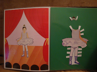
I used GIMP to create all of Zoey's clothes, always keeping the doll Zoey on screen as a template so that arms and legs would match. In all, I created two princess dresses (blue and yellow), Daphne (from Scooby Doo doncha know), a Scottish girl, a ballerina, a mermaid, and fairy.

The doll is printed on glossy laser printer paper and adhered with Modge Podge to chipboard, which was cut to size (EXACTO knife and scissors). The clothes were all printed on the same glossy paper.

When all was said and done, I thought, how am I going to give this to her, in a Ziploc bag? I didn't feel like making a box, particularly as at the time I was finishing her brother's pirate chest (stay tuned for that). I decided to put everything in a "book." I created a little map called "Zoey's World" that featured places Zoey the Doll may wish to visit using the particular outfits I made. I included a castle (natch), horse stables and pasture, a village (that would include libraries, museums, theaters, shops), an animal sanctuary, a haunted house, an amusement part, a magic pool, and a pirate cove. Zoey & I recently spent time in an amusement park, and I thought the pirate cove may encourage Zoey and her brother to make-believe together.

In the book, each outfit has its own two-page spread: the verso depicts the Zoey Doll in the outfit somewhere in Zoey's World; the recto holds the outfit itself.

I'm pretty happy with the way it turned out, though I wish that I had been able to make more outfits. Also, I learned so much more about GIMP as I worked and, as I said, have really come to enjoy that program.

So, below is the book I made for Zoey. I wanted to put the images in as a slideshow, but now that Picasa is Google Plus images, I can't seem to figure out how to do that. (??)